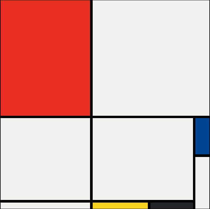
Mondrian Art

This challenge comes from a Full stack Bootcamp from App Brewery. I took advantage of the opportunity to test my knowledge of Flex Box after having completed the challenge with a grid layout. This is my first true flex vs grid study and you can toggle dimensions and specs for each piece.

I have recreated this piece both with Flexbox and Grid.

Row 1 Col 1

240px
310.5px

Row 1 Col 2

grow 1
grow 1

Row 2 Col 1 Row 1

240px

Row 2 Col 1 Row 2

240px
grow-1
270px

Row 2 Col 2 Row 1

Row 2 Col 2 Row 2 Col 1

148.5px

Row 2 Col 2 Row 2 Col 2

grow 1

Row 2

Col 3

Row 1

240px

Row 2

Col 3

Row 2

grow 1
grow-1

You can toggle the dimensions on and off with the button on the right. The entire piece is 561 x 561px. I used a gap of 6.75px between all flex-items. The piece is broken up into 2 rows, each row with a different number of columns and/or rows. I used flex-grow: 1 to have the last element of each row/column to take up all remaining space.

The Art pieces meassure 561px wide and 561px tall and therefore cannot fit on some mobile devices. On a bigger screen you could interact with the piece and see how the CSS Flex works. Try changing devices!

Row 1 Col 1

240px
310.5px

Row 1 Col Span 3

310.5px

Row 2 Span 2 Col 2 Span 2

220.5px

Row 2 Col 4

Row 2

Col 4

97.5px

Row 3

Span 2

Col 4

138.75px

Row 4 Col 1

240px

Row 4 Col 2

148.5px

Row 4 Col 3

114px

You can toggle the dimensions on and off with the button on the right. The entire piece is 561 x 561px. I used a gap of 6.75px. Both the CSS and the HTML is mush simpler as I just specified pixels for the grid-template-colums and grid-template-rows, changing the background-color of each corresponding div.

The Art pieces meassure 561px wide and 561px tall and therefore cannot fit on some mobile devices. On a bigger screen you could interact with the piece and see how the CSS Grid works. Try changing devices!